Are there any other metric beyond the ones from confusion matrix that can help us to evaluate a classification model? Let’s talk about that…
In the first part, we mainly explored metrics related with the confusion matrix (You can find the first part here, please read it before continuing here). And one could think that only those metrics exist, but there a few more that can give us important insights about the performance of a classification model.
Before starting, it is important to have in mind that a machine learning model will need some work to get a good value on an evaluation metric, like feature engineering, and parameters tuning. These topics will not be discussed here yet, but it something that you must have present. With no further to say, let’s talk about some other classification model metrics.

Log Loss
This metric is usually used on binary classification models. It measures the performance of a model by computing the difference between the actual and predicted class probabilities for each data point.
It is worth mentioning that this metric will be used mainly with probabilistic classification models, that means, those models that return a number between 0 and 1 which denotates the likelihood of that observation to be part of a class (typically the positive class, i.e 1). Therefore, log loss is a logarithmic loss function that measure the difference between the predicted probability and the true class label.
Assume that ŷ is the probability given by a classification model that denotates the probability of each data point belonging to class 1, and y is the true label class (either 0 or 1). Then, it is possible to define the log loss as:
L(y, ŷ) = -(y * log(ŷ) + (1 - y) * log(1 - ŷ))
By seeing the later formula, we can see that this metric measures the distance between the true class label and the probability given by the model. Also, it penalizes the model heavily if this predicts a probability close to 0 for a data point that actually is part of the class 1, or vice versa.
In Python, we can use Scikit-learn to get the log loss of a model like this:
from sklearn.metrics import log_loss# Assume these are the true labels
y = [0, 1, 1, 0, 0]
# Assume these are the probabilities given by a probabilisitc classification model
y_pred = [[0.9, 0.1], [0.4, 0.6], [0.3, 0.7], [0.8, 0.2], [0.2, 0.8]]
# We can now calculate the log loss
ll_score = log_loss(y, y_pred)
print("The log loss score is:", ll_score)
# The log loss score is: 0.5610885094221719
In addition, the log loss calculates a score for each data point, and the overall log loss for the model is the average of these scores across all the data points. A lower value for this metric indicates a better performance. Finally, it is worth mentioning that this value could be useful when dealing with imbalanced classes, and the accuracy score might not be a good fit for the situation.
If you want to go beyond this text, please consider to read this fantastic explanation by Gaurav Dembla.
Gain & Lift Chart
These are not necessary a numeric metrics, but a visual representation of the model’s performance (a graph).
It is worth to mention that both charts, gain and lift, are based on the concept of decile analysis. This analysis includes dividing the data into 10 equal groups based on the predicted probability of the target variable (e.g. 1,000 observations can be divided into 10 groups of 100 observations each).
In the case of the gain chart, it indicates the accuracy of predicting the target variable based on the portion of the sample selected for testing. In other words, it demonstrates how much better the model’s predictions are compared to random guessing as the sample size increases.
In order to create a gain chart, we need to sort the data by the predicted probability of the target variable and divide them into ten equal groups. After that, we have to calculate the percentage of the target variable that is correctly predicted for each group and plot it against the percentage of the total sample. The chart will show how much better the predictions given by the model are compared to random predictions.
On the other hand, the lift chart shows the ratio of the performance of a classification model to the performance of a random selection model. It is usually used in marketing areas to evaluate how effective a predictive model is to identify the most responsive customers.
To plot a lift chart, we will calculate the ratio of the percentage of the target variable that is correctly predicted by the classification model to the percentage that would be predicted by a random model for each decile. This chart will shows the ratio of the model’s performance to random predictions. If the lift chart is above the diagonal line (just like the ROC) indicates that the model is doing better than random.
We can use Python to plot the Gain and Lift charts. It must be said that since we need a good amount of data to plot those charts, we will be using some function from Scikit-Learn, also we will take some help from Logistic Regression to do some classification. Having those ideas in mind, we can plot these charts like this:
# Libraries
import matplotlib.pyplot as plt
from sklearn.datasets import make_classification
from sklearn.linear_model import LogisticRegression
from sklearn.model_selection import train_test_split
from scikitplot.metrics import plot_cumulative_gain, plot_lift_curve# Create a random dataset for classification
X, y = make_classification(n_samples=1000, n_classes=2, random_state=1993)
# Train a simple logistic regression
# NOTE: A logist regression should not be used just like this, you need to tune some hyperparameters and ensure a good performance
# but in this example, this will do
lr_model = LogisticRegression()
lr_model.fit(X_train, y_train)
# Get the probabilities of the predictions, see how we use "predict_proba" function instead of "predict"
y_prbs = lr_model.predict_proba(X_test)
# Plot the cumulative gain chart
plot_cumulative_gain(y_test, y_prbs)
plt.show()
# Plot the lift chart
plot_lift_curve(y_test, y_prbs)
plt.show()
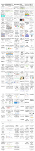
From the above piece of code we will get these charts


If you want to go further and understand better these charts, you could check this excellent video from Dr Noureddin Sadawi. In addition, you can read more about these charts in this amazing post by Cornellius Yudha Wijaya.
Kolmogorov-Smirnov statistic
It is usually referred as “KS” because of its initials. This metric is used to evaluate the performance of a binary classification model. The KS is the maximum difference between the cumulative distribution functions (CDFs) of the true positive rate (TPR) and false positive rate (FPR) curve. So, it will measure the degree of separation between the TPR and the FPR for different probability thresholds of the classifier.
One can think that this sounds like something like the ROC, if you do so, you have good intuition with that, since KS statistic measures the maximum vertical distance between the ROC curve and the diagonal line, which represents a random classifier. Therefore, a higher KS statistic indicates better separation between positive and negative classes which means a better performance of the classification model.
The formula to calculate the KS statistic is:
KS = max(TPR - FPR)
Remember that we need to calculate TPR and FPR at different probability thresholds by varying the cutoff value for classifying the positive and negative classes (similar to what we do when calculating the ROC)
To calculate the KS statistic using Python we will be using Scipy library instead of Scikit-Learn this time, so we can do it like this:
# Import libraries
from scipy.stats import ks_2samp# Declare some dummy list with predicticted scores for negative and possitive classes
negative_class_scores = [0.1, 0.3, 0.5, 0.7, 0.9]
positive_class_scores = [0.2, 0.4, 0.6, 0.8, 1.0]
# Calculate the KS statistic and p-value
ks_statistic, p_value = ks_2samp(negative_class_scores, positive_class_scores)
print("KS statistic:", ks_statistic)
# KS statistic: 0.2
print("p-value:", p_value)
# p-value: 1.0
If you are interesting in going beyond about this metric, consider give a read to this enjoyable post by Vinicius Trevisan
Gini Coefficient
It could be also called Gini Index or Gini impurity. In the context of a classification model, it will measure the diversity of a dataset. Its most common use is when deciding which feature to split on decision tree algorithms.
But in the case of evaluation metric for binary classification models, it measures the probability of a randomly chosen sample being misclassified. It will measure the degree to which a model’s predictions deviate from random guessing, and it’s given by:
Gini = 2*AUC - 1
It is important to note the AUC term in the later equation. This Area Under the Curve is related to the ROC. And a higher Gini coefficient indicates better classification performance. Please note that a model with Gini coefficient of 0.5 is the same as a random guessing, but a value of 1 indicates a perfect predictive power.
To calculate the Gini coefficient using Python, we can use Scikit-Learn and apply the formula given above like this
# Libraries
from sklearn.metrics import roc_curve, auc# Assume these are the true labels
y = [0, 1, 1, 0, 0]
# Assume these are the probabilities for the class we want to evaluate
y_pred = [0.9, 0.4, 0.3, 0.8, 0.2]
# Get the fpr, tpr and threshold from ROC
fpr, tpr, thresholds = roc_curve(y_true, y_pred_prob)
# Get the AUC value
auc_score = auc(fpr, tpr)
# Calculate Gini Coefficient
gini = 2 * auc_score - 1
print("The Gini Coefficient is:",gini)
# The Gini Coefficient is -0.33333333333333326
Finally, to go in more detail, please consider to read this wonderful blog by Idan Schatz, which explore the idea and computation of Gini Coefficient in more detail with a understandable example.
Misclassification Rate
This metric measures the proportion of incorrectly classified observations, in other words, it sums the number of times that the model misclassified an observation and divides it by the total number of observation in the dataset. A formula to describe this metric is:
Misclassification rate = (FP + FN) / (TP + TN + FP + FN)
The lower the misclassification rate is, the better the performance of the model. But, you must have in mind that this metric does not consider the relative cost or benefits of different types of misclassifications, which can be important depending in the context you are working with.
One might think that this definitely sounds like accuracy, and that line of thought is in the right direction, but while accuracy measures the times the model did it correctly, the misclassification rate computes the times a mistake was made by the model.
To calculate this metric in Python, we can do it similar to when we calculated the accuracy, like this:
# Libraries
from sklearn.metrics import confusion_matrix# Assume the y true labels and the predicted ones
y = [0, 1, 0, 1, 1, 0, 0, 1]
y_pred = [1, 1, 1, 1, 0, 1, 0, 0]
# Get the necessary values from the confusion matrix
tn, fp, fn, tp = confusion_matrix(y, y_pred).ravel()
# Computes the misclassification rate
misclassification_rate = (fp + fn) / (tn + fp + fn + tp)
print("Misclassification rate:", misclassification_rate)
# Misclassification rate: 0.625
Jaccard Index
This is also called Jaccard Similarity coefficient or intersection-over-union score. It measures the similarity of two sets, in this case, the real one and the predicted one. We can calculate the Jaccard Index by dividing the number of labels that are correctly predicted (true positives) by the total number of labels across both sets. In other words, this metric tells you how similar the predicted labels are to the true labels, by having both the number of correct predictions and the total number of predicitions in consideration.
A formula to calculate the Jaccard Index is:
Jaccard Index = (true positives) / (true positives + false positives + false negatives)
It ranges from 0 to 1, with 1 being a perfect overlap between the predicted and true positive instances, and a value of 0 indicates no overlap. Therefore, a higher Jaccard index indicates a better performance of the model.
In Python, by using Scikit-Learn we can calculate this metric like this:
# Libraries
from sklearn.metrics import jaccard_score# Assume the y true labels and the predicted ones
y = [0, 1, 0, 1, 1, 0, 0, 1]
y_pred = [1, 1, 1, 1, 0, 1, 0, 0]
jaccard_index = jaccard_score(y, y_pred)
print("Jaccard index:", jaccard_index)
# Jaccard index: 0.2857142857142857
To summarize, we have discussed different evaluation metrics for classification models that can be helpful to understand better the performance of a model. Joined with the first part, we now have a good set of metrics to understand how our classification models are doing it.
It is always important to have in mind that an evaluation metric will also depend on the context, and there will be always a need to tune parameters and do some feature engineering to improve the metric of a model.
Thanks for reading!