
What is Data Visualization
Data visualization is the practice of representing data and information in visual formats, such as charts, graphs, maps, and other visual elements. The goal of data visualization is to make complex data more understandable, accessible, and interpretable. It involves transforming raw data into visual representations that allow patterns, trends, relationships, and insights to be easily identified and communicated.
Data visualization serves as a bridge between the raw data and human understanding. Instead of trying to interpret raw numbers, data visualization uses graphical elements to convey information in a way that is intuitive and meaningful. This enables individuals, including data analysts, researchers, business professionals, and the general public, to quickly grasp the significance of the data.
Data visualization is essential for effectively communicating insights, supporting decision-making, and driving understanding. Well-designed visualizations consider aspects like the choice of visualization type, colors, labels, and axes to ensure that the intended message is conveyed accurately and efficiently. Whether it’s for conveying research findings, business analytics, scientific discoveries, or even presenting data-driven stories, data visualization is a powerful tool that aids in making sense of data.
DATA VISUALIZATION
Prominent Types of data visualizations are :
1. Bar Charts : Bar charts compare different categories or show the distribution of data.
2. Histograms: These display categorical data using rectangular bars.
3. Line Charts: These show trends over time by connecting data points with lines. They are commonly used for tracking changes in data over continuous intervals.
4. Pie Charts: These represent parts of a whole, typically using slices of a circle to show the proportions of different categories.
5. Scatter Plots: These show individual data points as dots on a graph, helping to visualize the relationships between two variables.
6. Maps and Geographic Visualizations: Geographical data is visualized on maps to show patterns and distributions across different regions.
7. Heatmaps: These use colour gradients to represent the density or intensity of data values in a specific area.
8. Tree Diagrams: These show hierarchical relationships between data points, often used to visualize organizational structures or classification systems.
9. Network Diagrams: These display relationships between entities as nodes connected by lines, useful for visualizing social networks or interconnected systems.
10. Infographics: These combine text, images, and visual elements to present complex information in a visually appealing and easy-to-understand format.
Need of Data Visualization
Imagine you’re given a big bag of colorful flowers. Now, let’s say someone asks you how many flowers of each color are in the bag. It might be a bit difficult to count and remember all the numbers , right? That’s where data visualization comes in, it helps us understand and work with lots of information, like numbers and facts. It’s like having a magical way to turn those numbers into pictures that tell us exactly what’s inside the bag.
Significance of Data Visualization
Imagine a wizard holding a wand and casting a spell over a pile of numbers. As the wizard waves the wand, the numbers transform into colorful and vibrant pictures, graphs, and charts that float in the air. These visualizations tell a story that your brain can quickly grasp, helping you understand the data without having to go through each number individually. Just like magic, data visualization makes the information come alive and easier to understand!
Here’s why it’s so important:
1.Easy Understanding: Pictures are easier to understand than a list of numbers. When you see a picture, your brain can quickly see patterns and trends that might not be obvious in raw numbers.
2. Spotting Stories: Have you ever looked at a picture and thought about what might have happened before the picture was taken? Data visualizations are like pictures that tell a story about the data. They show you what’s happening and help you ask questions like “Why is this going up?” or “Why is that going down?”
3. Sharing Insights: Just like you show your drawings to friends, you can show data visualizations to people to explain your findings. It’s like showing a treasure map to tell them where the “treasure” in the data is hidden.
Importance of Data Visualization
The importance of data visualization cannot be overstated in today’s data-driven world. It serves as a bridge between raw data and human understanding, offering a multitude of benefits that are critical for decision-making, communication, and exploration:
1. Enhanced Understanding: Data visualizations distill complex datasets into intuitive visuals, making it easier for individuals to comprehend intricate patterns, trends, and relationships that might not be evident from raw numbers alone.
2. Efficient Communication: Visuals transcend language barriers, allowing for effective communication of insights across diverse audiences. Decision-makers, stakeholders, and experts can all grasp the information rapidly, fostering more productive discussions and collaborations.
3. Quick Insights: Visualizations enable rapid extraction of key insights from data without requiring advanced statistical knowledge. This empowers professionals at all levels to make informed decisions swiftly.
4. Identification of Anomalies: Graphs and charts facilitate the identification of outliers or anomalies that could signal errors, inconsistencies, or unique opportunities within the dataset.
5. Data-Driven Storytelling: Effective visualizations tell a story. They guide viewers through data trends and insights, enabling analysts to present findings in a coherent, persuasive, and memorable manner.
6. Pattern Discovery: Visualizations uncover hidden patterns and correlations that might not be immediately evident through traditional data analysis methods. These discoveries can lead to novel hypotheses and further exploration.
7. Better Decision-Making: Informed decisions hinge on a clear understanding of the data. Visualizations provide decision-makers with a comprehensive overview, enabling them to weigh pros and cons effectively.
8. Operational Efficiency: Data visualizations facilitate monitoring and optimization of processes by providing real-time insights. This can result in improved resource allocation, cost savings, and increased efficiency.
9. Predictive Analysis: Visualizations enable the visualization of predictive models, allowing stakeholders to visualize potential outcomes and assess the impact of different scenarios.
10. Performance Evaluation: Visual representations of performance metrics help track progress towards goals and objectives, providing a basis for strategic adjustments when necessary.
11. Accessibility: With the rise of data literacy, data visualizations democratize information access. They empower individuals across various skill levels to engage with data and derive meaningful insights.
12. Competitive Advantage: Organizations that harness data visualization effectively are better equipped to stay competitive. Data-driven insights enable innovation and agility in decision-making.
13. Interdisciplinary Collaboration: Data visualizations encourage collaboration between professionals from different fields. People with diverse expertise can jointly explore data, fostering interdisciplinary breakthroughs.
14. Personal Empowerment: Proficiency in data visualization empowers individuals in various roles to analyse and present data effectively, enhancing their professional value and versatility.
In essence, data visualization transcends its role as a tool; it serves as a conduit for knowledge, empowerment, and transformation. By translating data into visuals that are easily digestible and relatable, data visualization democratizes information and empowers individuals to unlock the potential within datasets, leading to smarter, data-informed decisions and actions.
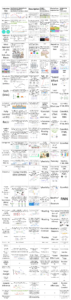
Data Visualization Tools
These are some Data Visualization tools
1. Tableau
2. Looker
3. Zoho Analytics
4. Sisense
5. IBM Cognos Analytics
6. Qlik Sense
7. Domo
8. Microsoft Power BI
9. Klipfolio
10. SAP Analytics Cloud
11. Yellowfin
12. Whatagraph
Description of Tools:
1. Tableau:
Pros:
– Intuitive drag-and-drop interface for creating complex visualizations.
– Rich interactivity and exploratory data analysis.
– Strong community support and extensive learning resources.
– Wide range of connectors for various data sources.
– Ability to create interactive dashboards and share them easily.
Cons:
– Can be expensive, particularly for larger organizations.
– Learning curve for advanced features.
– Some advanced calculations may require scripting.
2. Looker:
Pros:
– SQL-based interface offers advanced users greater control.
– Centralized model for consistent data definitions.
– Supports embedding analytics into other applications.
– Strong data exploration capabilities.
– Collaborative features for report and dashboard sharing.
Cons:
– Learning curve, especially for non-technical users.
– Requires some SQL knowledge.
– Limited chart customization options compared to other tools.
3. Zoho Analytics:
Pros:
– User-friendly interface suitable for both technical and non-technical users.
– Extensive range of data connectors.
– Offers integrated business intelligence and reporting capabilities.
– Collaboration and sharing features.
– Affordable pricing options.
Cons:
– May not be as feature-rich as some other tools.
– Customization options might be limited for advanced users.
– Advanced analytics capabilities are relatively basic.
4. Sisense:
Pros:
– User-friendly interface for creating interactive dashboards.
– In-chip technology for faster data processing.
– Good scalability for handling large datasets.
– Supports data blending and transformation.
– Strong customization options for dashboards.
Cons:
– Can be complex for beginners.
– Pricing can be on the higher side.
– Limited advanced analytics capabilities compared to some other tools.
5. IBM Cognos Analytics:
Pros:
– Enterprise-level tool with advanced reporting and analytics capabilities.
– Supports complex data scenarios and business intelligence.
– Integrates well with other IBM products.
– Offers robust security features for enterprise data.
Cons:
– Steeper learning curve due to its comprehensive features.
– Can be costly, especially for smaller organizations.
– User interface may feel outdated compared to newer tools.
6. Qlik Sense:
Pros:
– Associative data model for intuitive exploration.
– Drag-and-drop interface for creating interactive dashboards.
– Strong data visualization and storytelling capabilities.
– Supports real-time data connectivity.
– Good for users who prefer free-form exploration.
Cons:
– Pricing can be a concern for some organizations.
– Limited advanced analytics features.
– Learning curve for more complex scenarios.
7. Domo:
Pros:
– User-friendly interface with templates for quick dashboard creation.
– Provides a variety of connectors for data sources.
– Supports real-time data integration and updates.
– Collaboration features for sharing insights.
– Mobile app for accessing dashboards on the go.
Cons:
– Limited customization compared to some other tools.
– Pricing might be higher for advanced features.
– Learning curve for more advanced analytics and data manipulation.
8. Microsoft Power BI:
Pros:
– Tight integration with Microsoft products and services.
– User-friendly interface with drag-and-drop capabilities.
– Large community and extensive learning resources.
– Wide range of connectors and data transformation options.
– Affordable pricing options, including a free version.
Cons:
– Limited advanced analytics capabilities compared to some tools.
– Complex calculations might require DAX knowledge.
– Some features may require a strong understanding of data modeling.
9. Klipfolio:
Pros:
– Focus on real-time data visualization and dashboard creation.
– User-friendly interface with pre-built visualization components.
– Good for small to medium-sized businesses.
– Integrates with various data sources.
Cons:
– Might lack some advanced analytics capabilities.
– Limited customization options for visuals.
– Learning curve for more complex data manipulations.
10. SAP Analytics Cloud:
Pros:
– Cloud-based solution with collaborative features.
– Integrates with other SAP products and services.
– Supports predictive and advanced analytics.
– Real-time data connectivity and visualization.
Cons:
– Can be complex for non-technical users.
– Learning curve for advanced features.
– Pricing might be higher compared to some other tools.
11. Yellowfin:
Pros:
– User-friendly interface for creating visualizations and reports.
– Offers storytelling features for data narratives.
– Good for collaborative reporting and sharing insights.
– Supports mobile access and responsive design.
Cons:
– Might lack some advanced analytics features.
– Customization options for visuals might be limited.
– Learning curve for more complex data scenarios.
12. Whatagraph:
Pros:
– Simplifies data visualization with pre-built templates and drag-and-drop features.
– Focuses on automated reporting and dashboard creation.
– Suitable for marketing and business reporting needs.
Cons:
– Might be limited in terms of advanced analytics capabilities.
– Customization options could be restricted compared to more comprehensive tools.
– Primarily geared towards specific reporting needs.
Reference:
https://www.geeksforgeeks.org/data-visualization-tools/
https://images.app.goo.gl/zLbBm3jevESd78ca9
https://revopsteam.com/tools/best-business-intelligence-software/
https://www.stxnext.com/blog/business-intelligence-tools/
https://neilpatel.com/blog/data-visualization/
https://images.app.goo.gl/wS9sVcmFxentTVdX7
https://images.app.goo.gl/Xh88qDDb1tWtiBH89
https://images.app.goo.gl/QpVP51rv9HUbmfBA9
https://www.aihr.com/blog/data-visualization/
https://images.app.goo.gl/t91qDadzwvHJeyFy7
https://images.app.goo.gl/53Vrm8NogfU6m9Fy7
https://images.app.goo.gl/yQprCG3Snmdsvym77
https://images.app.goo.gl/hX4SwdwjtrGEzZR76
https://images.app.goo.gl/TACsSBaqDs4LT62s5
https://images.app.goo.gl/Zu4iNeArYRnVKEFP9
https://www.softwareadvice.com/reporting-tools/ibm-cognos-analytics-profile/
https://images.app.goo.gl/7cbRTHkxe3KpFFxp8
https://learn.microsoft.com/en-us/power-bi/fundamentals/desktop-what-is-desktop